Game Overview

Which Witch is Gonna Be Rich is a game project under UCI's Video Game Development Club, where fellow students get together to build a game over the course of 8 weeks.

You play as a witch managing a potion shop, where you are tasked with purchasing potion materials, brewing a variety of potions, and selling potions to customers.

Discover the variety of potions you can brew, and do your best to make the most bank!

Check out the game here!

ROLE

UI/UX Designer

Duration

8 weeks

tools

Figma
Aseprite

TEAM

1 Team Lead
4 Programmers,
3 Artists,
2 UI/UX Designers
1 Game Designer
1 Project Manager

Gameplay Loop

My TAsks

Once the core gameplay loop was decided, the UX team began assigning interfaces and flows amongst each other.
In my case, I became responsible for the interfaces relating to the Inventory BarBrewing Menu, Potion Stocking, and Main Title Screen.

Generating a theme through mood boarding

While the core mechanics and gameplay loops were still being finalized, I took the initiative and started mood boarding with the other UI/UX Designer to get a general theme for the interfaces. I also investigated other shop simulator interfaces, giving our team a better idea of what types of flows and interactions to design.

Inventory Bar

Conceptualizing

As inventory has to be easily viewed and quickly assessed, I focused on a minimalistic inventory UI that was still clear. I began by conceptualizing color palettes for the inventory.
I presented these options to the team, and after internal discussion of what fit the vibes more, we decided to go with the fourth option. The dark border matched the dark witch academia theme we were going for, and the lighter slots allowed for inventory items to stand out.

styled in pixel art

I then designed the inventory bar in pixel art. I ensured that the hotkeys were visible in the top right, allowing players to quickly scan which items are assigned to which keys. Including the golden selector border makes it very clear which items are currently being selected. Finally, the custom-made quantity digits take up a large portion of the individual grid, easily communicating how many items a player is holding.

Brewing Menu

Flow

This is a simple user flow of how users would interact with the brewing menu, guiding me in designing a lo-fi prototype. I focused on interaction and clarity over visuals during this stage.

Low-Fi

I designed a two-column interface, with materials accessible on the left side, and the brewing input/output slots on the right side. Materials are separated into tabs for organization purposes. Finally, the 'Brew' Button is designed to only light up once Liquid and Catalyst materials are inserted, adding constraint for user clarity.

styled in pixel art

Using the Lo-Fi as a base, I designed the Brewing Menu for the final build.

The tab system for materials has been slightly modified to be a selector interface, fitting the pixel aesthetic better.

Playtesting

About five weeks into the project, we were given an opportunity to test our in-progress game with fellow UCI students. Students would simply drop in to our booth at the Playtesting Room, giving the game a quick spin.

Questions

As these playtests were informal and guerilla in nature, I drafted a series of question that my attending team members could ask play testers. These questions included:

❓Overall, what did you think about the game?
❓Were there any confusing elements in the gameplay?
❓Do you have any suggestions for our team?
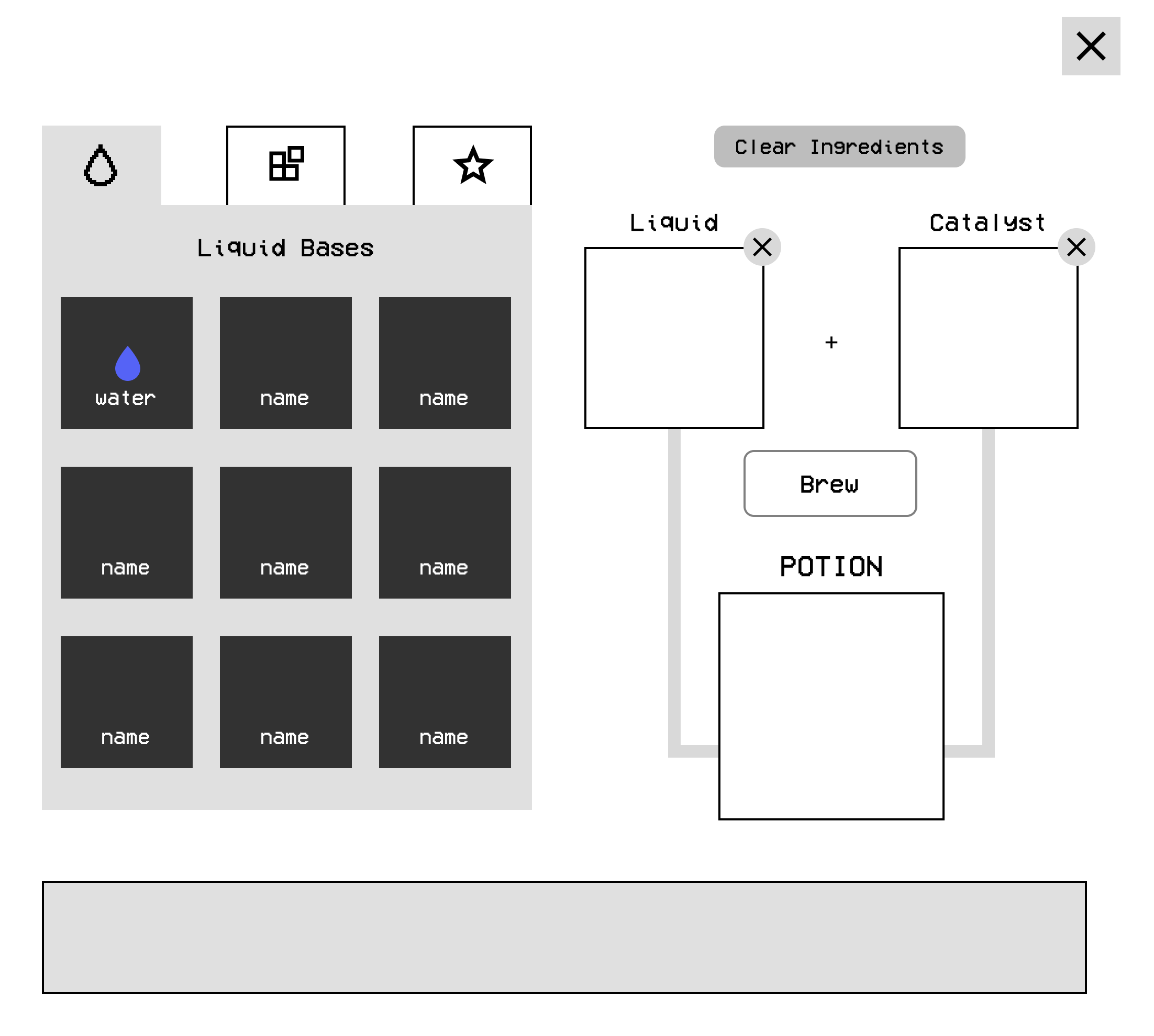
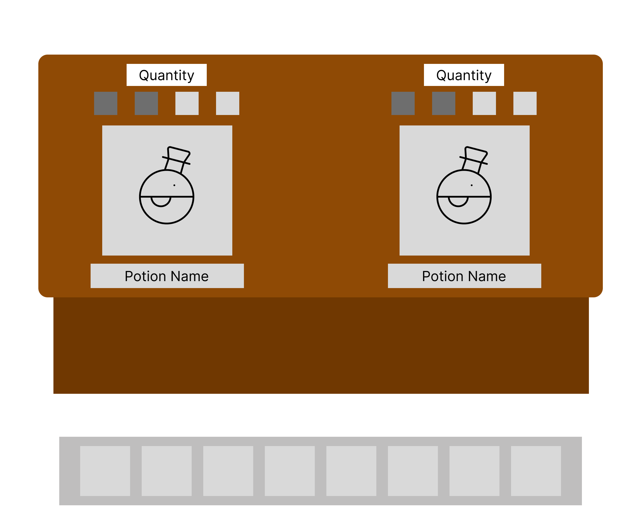
❓Is it clear what the buttons and interactions in the brewing menu do?
❓Do you have any suggestions for improving the brewing system, whether it be gameplay-wise or UI-wise?


Feedback

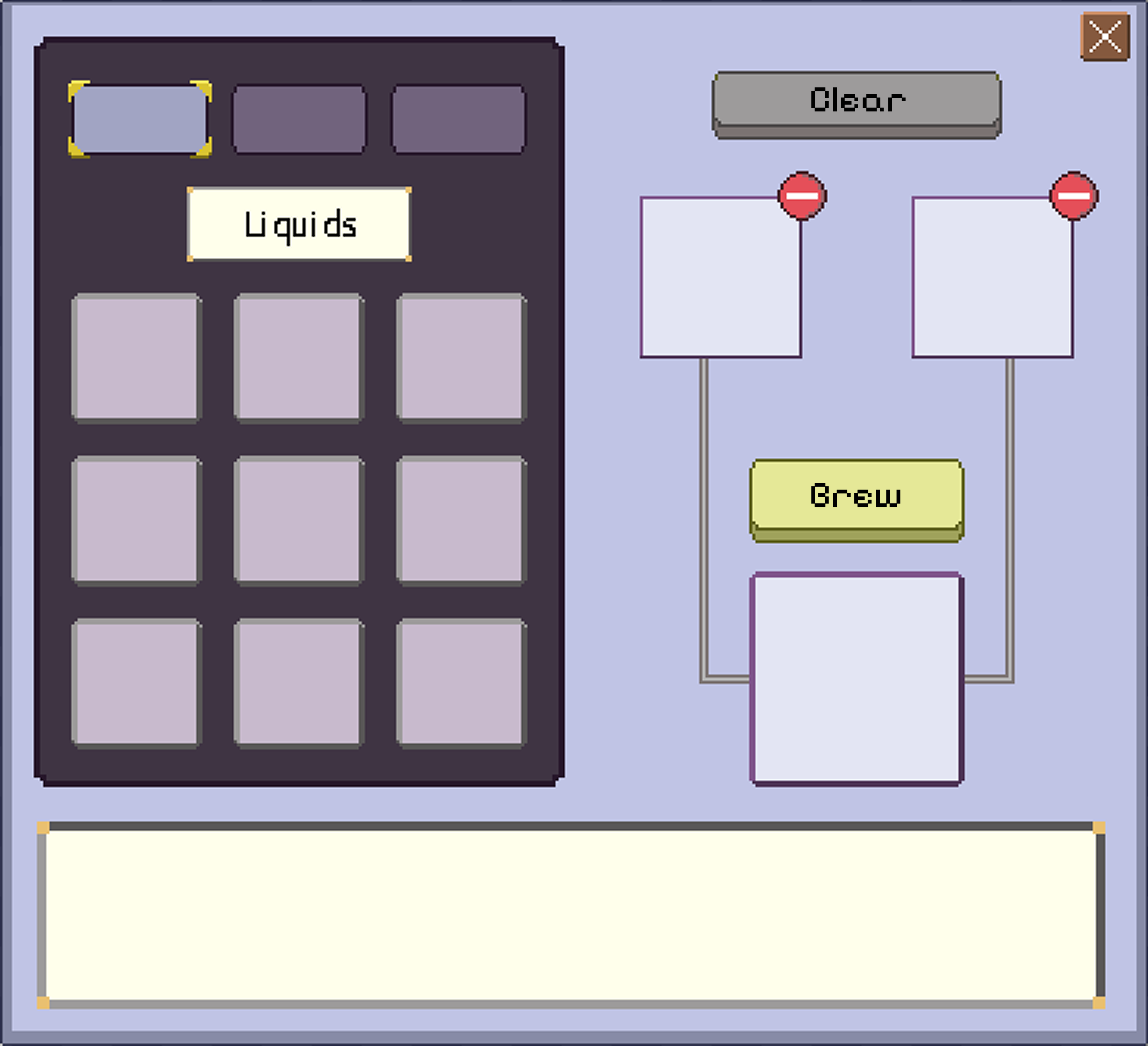
❗Players liked the arrangement of the brewing menu
❗The bottom part of the brewing menu could be repurposed to show recipes, like a memo book.
❗The inventory seems a bit redundant, as there is an inventory in the brewing menu.
❗The player sprite feels slightly too large, in comparison to the environment.

In general, players really liked the art and mechanics for the game, making our team more confident in our design direction.

Brewing ui changes

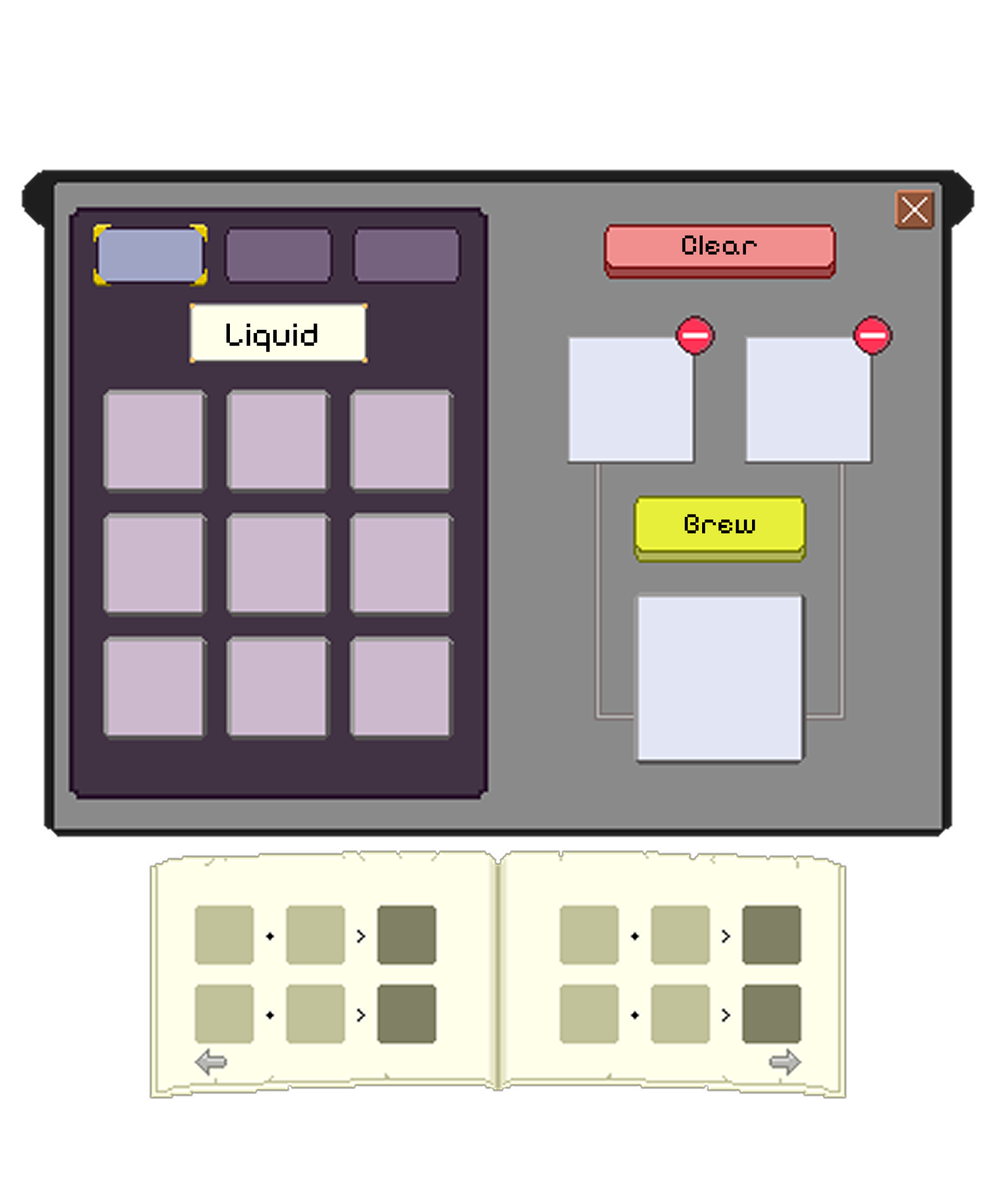
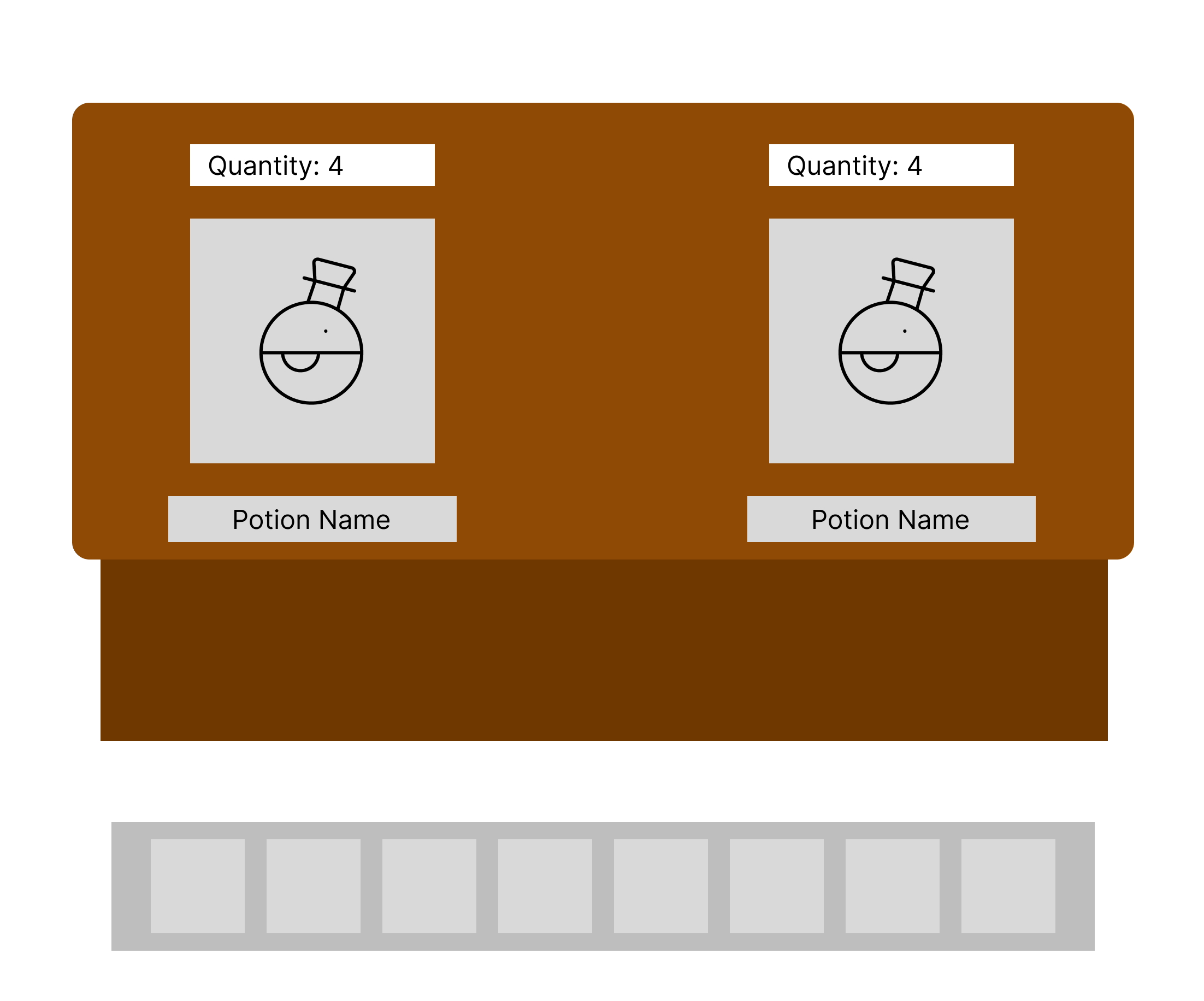
Based on player feedback, I revised the text bar at the bottom. Originally meant to show item descriptions, it is now a small memo book, allowing for learned recipes to appear at the player's convenience.

In addition, the shape of the menu has been revised to fit the cauldron theme better, and the button for clearing ingredients has been changed to red for better visibility.

Potion Stocking Menu

Flow

Next, I created a flow for the Potion Stocking interaction, detailing how players initially stock a potion, as well as how they may increase the quantity.

Low-Fi

Variant 1: Grid-Based
Variant 2: Indicator-Based
Variant 3. Text-Based
I created three variants for the layout, each having different ways of displaying potion quantity. After internal discussion with the team, we decided on Variant 2, as Variant 1 seemed visually redundant, and Variant 3 lacked easy scan-ability.

styled in pixel art

Within the game environment, there were actually two shelves: one that holds 4 potions, and one that holds 2 potions. Both versions of the shelves were kept similar, in order to keep the development timeline feasible.

Main Menu

Finally, I created both the background, game logo, and menu buttons in pixel art. Inspired by games such as Stardew Valley, I felt that a night sky fit the gothic, dark-academia, and cute theme of our game.

Reflection

This project was the first time I used Aseprite to design pixel art (shoutout Danica for showing me some tips!), and it was a ton of fun to learn! I also gained a lot of experience working in a cross-functional team, having to frequently communicate with artists to delegate pixel-art tasks, with developers to understand coding constraints and specific UI placement, and fellow designers to ensure that our flows were well-integrated. I'm definitely gonna keep working on games moving forward, and it was an amazing experience working with so many cool artists, developers, and designers.